BBC
- Whilst "Search R4" might be useful this should go at the bottom"
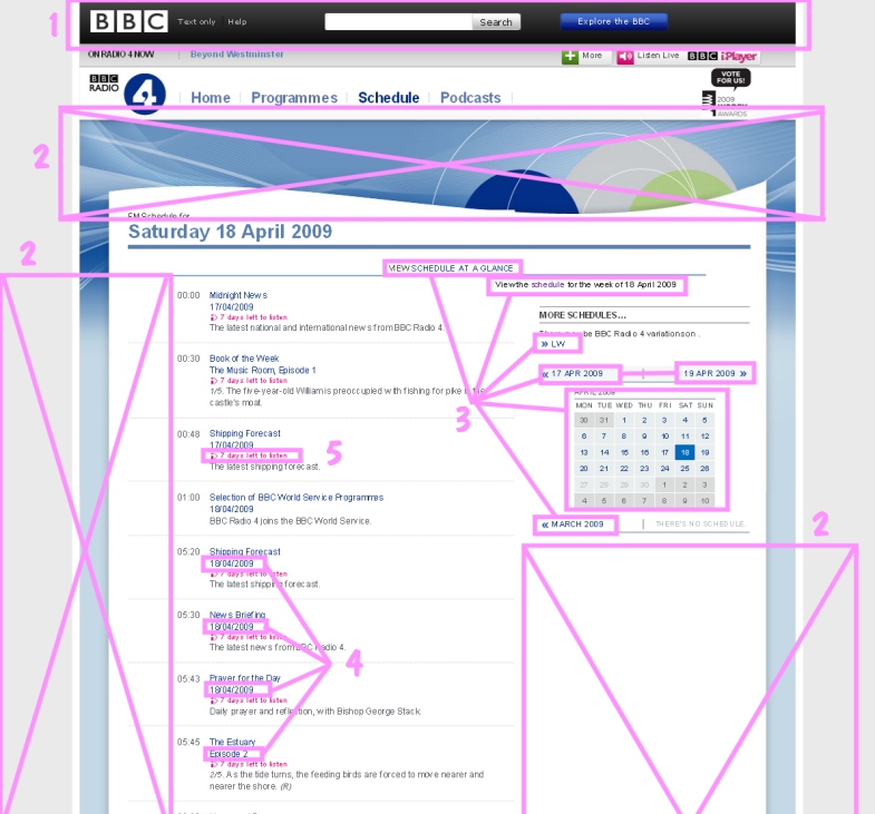
- News readers don't leave long pauses between each word so why is there so much wasted space on the web pages?
- More information about schedules scattered around higgldy-piggeldy. On a long page perhaps the calendar should be shown in a long column rather than blight one third of the page with wasted space beneath.
- The date as a sub-title. It isn't useful and it gets confused with the main title. (To fix this blot is trivial so clearly nobody has actually thought about it.)
- Listen again takes up more precious vertical space.
The useful information is spread all over the place and hidden in the camouflage.
|
Mine
- People want to look at what's on their other favourite stations as well. Compact jump-elsewhere buttons on the top row.
Let's make it easy - How simple
- When browsing the schedule, a week ahead and past at a time is enough for most people.
Let's make it easy - How simple
- The programme titles are the most important things.
Let's make them stand out (And put the whole page in larger text for easier reading.) - How simple.
- A compact headphones icon indicates listen again and the animated aerial indicates listen now.
Let's put all 'click to listen' things in one column. - How simple
- What do people want to do lots of with schedules... ...Read them ahead of time and mark things of interest.
Such an obvious need so let's do it. - How useful.
|


 gives listen again and clicking on