Articles:
1 |
2 |
3 |
4 |
5 |
6 |
7 |
Ask GOM | >Home Page>


Design notes for WWW authors
Use lists efficiently
How to avoid acne-vision
Communicate clearly and efficiently
Apply a way with words to sculpt a viewing experience
Use different styles for different effect
Be nice to your readers
Maintain interest
 There is plenty to read on this (35K) page and all the links to other pages
( shown as
There is plenty to read on this (35K) page and all the links to other pages
( shown as >link> ) are at the end
so you may want to go off-line while reading it.
 For those of you who don't know Essex, there are many miles of flat marshes with
corrugated creeks, the cries of geese and constant chafing of the wind in the reed beds.
With hurricane lamp we trudge to the pub and pass evenings in front of the range
swapping gossip and secrets of the old marshland crafts. In these notes I hope to pass
on to you many of the words of wisdom handed down from the likes of Sam Allen, Potty
Lightfoot and 'Monkey' Brougham.
For those of you who don't know Essex, there are many miles of flat marshes with
corrugated creeks, the cries of geese and constant chafing of the wind in the reed beds.
With hurricane lamp we trudge to the pub and pass evenings in front of the range
swapping gossip and secrets of the old marshland crafts. In these notes I hope to pass
on to you many of the words of wisdom handed down from the likes of Sam Allen, Potty
Lightfoot and 'Monkey' Brougham.

Articles:
1 |
2 |
3 |
4 |
5 |
6 |
7 |
Ask GOM | >Home Page>

Dear GOM,
What do you think of the choice of graphics on my home page? It advertises my dads
boatyard. Mark, Kent
 Dear Mark,
You have tried to make this interesting by adding some graphics, but really need now to
rethink the logical structure of your pages. You might also benefit from a bit of
brainstorming when it comes to the psychology of turning WWW visitors into boatyard
visitors.
Opening graphic
Does you opening graphic stand out enough to identify your page in the minds of the
visitor? I think it is an excellent attempt.
While your opening graphic is not an actual trademark it is like the sign hanging outside
the shop. It needs to be instantly recognisable, DESCRIPTIVE of the trade, describable
in one or two words and only as a bonus distinctive. The big boys have spent millions
of dollars on getting the public to associate some graphic with a product or a company.
You can't hope to compete on the same level, so limit yourself to the equivalent of a pub
sign that tells people what you do.
Your trademark needs to be bold so that it is RECOGNISABLE. If you want a guide to
what is instantly recognisable then consider:
- the colourful markings on and shapes of beetles, insects and snakes. Humans have
survived by avoiding poisons.
- Plump, curvy (but connected) greenery or fruity shapes shout 'juicy'. Hence the importance
of colour.
- People relate to people. A person represented even in cartoon form is a plus.
 On my wall above my desk I have a poster advertising beer. There is no foaming
glass in sight, just a lithograph of a woman representing the river Meuse
On my wall above my desk I have a poster advertising beer. There is no foaming
glass in sight, just a lithograph of a woman representing the river Meuse If you had
a coffee shop you could have a logo of a cup of steaming coffee. A better choice might
be a set of lips sipping.
If you had
a coffee shop you could have a logo of a cup of steaming coffee. A better choice might
be a set of lips sipping.
- There has been a design trend for disjointed logos in the past decade.
Don't try to apply a modern logo to a traditional business. As
they say in Steeple Creek: "A wooden mast gives - A metal one gives way."
For a boatyard, a few flags might be colourful enough to stand out and give enough
nautical flavour to the page. Your choice of a coxswain at the helm of a boat has the
personal touch to recommend it and is difficult to improve upon.
 Instead of using 256, colours try reducing the number of colours to 16. This halves the
number of bytes required per image, or doubles the size of image for the same wait
while downloading. Be considerate to your viewers.
Instead of using 256, colours try reducing the number of colours to 16. This halves the
number of bytes required per image, or doubles the size of image for the same wait
while downloading. Be considerate to your viewers.
Articles:
1 |
2 |
3 |
4 |
5 |
6 |
7 |
Ask GOM | >Home Page>
Dear GOM,
What do you think of the choice of graphics on my home page? Carl, London
Dear Carl,
I was not impressed. It is one of the great benefits of civilisation that we have given up
playing the game "my acne is better than yours". Unfortunately your page is covered by
acne-vision. Pointless graphics everywhere look like a pizza that has seen better days.
Neither do I want to wait for ever for boring pictures or recycled copies of record
companies marketing.
I suggest you think of your page as a carnival float.
- Decide on the theme.
- Devise the overall presentation
This is where a spark of imagination pays handsomely. For example you appear to
want everyone to know all the things that you get up to. Why not present your home
page as seen by the mice behind the skirting board, peeping out and commenting on
what's happening? This provides an opportunity for a narration of the images which
means that the images themselves don't have to tell the full story and can be reduced in
size, number and colour depth.
Remember that visitors want entertainment or information. Try and give both and you
won't go far wrong.
Every picture should convey an image to the viewer. Be particular about
that image. As they say in Tillingham: "Donkeys aren't stupid, just easily led".
Use the
cat-kitten test: Ask yourself is this a photograph of a cat or a kitten. The two are entirely
different creatures - one frisky and naughty, the other wary and crafty. Thats what cats
and kittens are about. The same applies to people. Is this a party animal or an athletic
champion? To tell we need more than a mug shot. If you haven't got the material then
you can't publish it - so go out and collect some.
We have all seen acne-vision WWW pages, and not all are private home pages either! A 'cool site' shouts 'go faster
stripes and
wide wheels'. Is that a recommendation or a fair pointer to self important graphics
making up for lack of content? As they say in Dengie at lambing time, "Pretty face, poor
price"
What makes a graphic stick in the mind? The answer doesn't lie in factuality but
- in striking a subconscious chord
- hitting a sensitive spot
- reviving a familiar image
Remember there are some trigger images
that are fairly good bets with a) people in general, b) men and c) women. If you want the
details rush off to the library and leaf through the books on marketing. In brief though,
you have to stimulate a bit of dreaminess which in turn is associated with pleasure.
Look at the split between text and pictures in newspapers and magazines.
Articles:
1 |
2 |
3 |
4 |
5 |
6 |
7 |
Ask GOM | >Home Page>
Dear GOM,
What do you think of my first attempt. Jill, Cornwall
Dear Jill,
You have at least had a go and put a sort of domestic business card on the WWW. If
you were really advertising then this level of plainness might be ideal. It is basically
factual but any reader can tell you have a 'green' outlook. A local councillor might
use exactly this sort of "I'm 45 and here's what's important to me" in an election leaflet.
But is that really what you want to convey? Surely you want to put a personality into
your page. Think of your page as your front garden. What does it say, or what would
you like it to say, about you? Neat and tidy. Garden gnomes? Pretty borders and well
mulched roses? Lively bird table or tarmac? How are you going to get across those
important but subtle personality traits?
By the use of imaginative design and what I call Radio Voices. The opening
paragraphs to this document are an example of RV. I'm painting a picture with
words and I'm speaking to you.
Here's how you make up your own:-
- Think of a topic of conversation
- Think of a suitable context for it, use artistic licence
- Can you describe that context easily in the contents page? Or will it mix in with
other topics in a self-describing context?
Simple eh? let me give you an example.
- [Topic] Wasn't it awful what they did to those trees in Humber Road.
- Some possible contexts
- What's been going on this month
- This could be a chat over a cup of tea. The immediate impression is a
comfortable, non-confrontational, civilised gossip.
- The council is out of control
- A headline from a political pamphlet distributed to the residents? Fire, calamity and
outrage! Sit up and listen.
- Wildlife under threat
- Something in between the other two contexts. The appeal of fluffy animals and
pretty birds. Concern. Facts to follow.
- Here are some ways of presenting these contexts in a WWW page
- I was only saying just the other day to Mrs Harris as we sat sipping (what a
difference you can make with "gin / tea", "verandah / beach / by the pool / on the bus / in the
Goat and Compasses" here) cocktails at the golf club... This can be placed in the
middle of a page with no introduction or title. Gossip flows - it isn't headings and sub-headings.
THE VOICE OF REASON
    1) Aren't men bastards  (a link)
    2) Fascist council vandalises park (a link)
    3) etc..
Well, you get the idea. Punchy points. This style might apply perhaps to a sales
brochure. (If you were selling your house and wanted to "set out the facts")
- This year there don't seem to be as many song birds as in previous years. What is
nicer than the calling of the cock sparrow in an English garden? Nationwide they seem
to be in decline. The trees in Humber road... This is in the form of an article or
essay. You have fine control over the essay style. The conventions of the form expect
you to present facts and opinions hopefully woven together to make a cast iron case.
The style depends on your skill as a writer and your success in your skill as a judge of your
readers.
You might find that a mix of these styles is needed to balance your pages. Certainly for
a personal home page, a single style shouts lack of imagination and hints at poor
presentation of whatever is 'inside'. This is a turn-off no matter how worthy the content.
Use graphics.
- Spot colour, as used here with the quotes "" and "" adds seasoning.
Like
seasoning, don't overdo it.
- Icons are useful signposts in a maze of
links. Use both as "click here to jump to..." and topic headings. Simplicity and
standardisation are the keys to instant recognition. In this
document I decided to use 'Question' and 'Answer' graphics to flag
the top of each article.
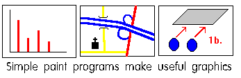
Diagrams, graphs and maps are easily
sketched out with simple painting programs. They can make a big impact and break up
blocks of text.
Articles:
1 |
2 |
3 |
4 |
5 |
6 |
7 |
Ask GOM | >Home Page>
Dear GOM,
My company, a brewery, has asked me to look at having a WWW page. Where do I
start. I would also like to know how many people will see it. Sarah, Norfolk
Dear Sarah,
Initially look upon this as an experiment. Putting together something is not difficult, but
the 90-90 rule applies (The first 90% of the job takes 90% of the time and the remaining
10% takes the other 90% of the time.) You can throw something together, but as people
look at it you'll want to improve it and show the world a presentation with smooth edges
and nice design.
Consider your WWW page as a sort of advertisement in the yellow pages. How would
you go about getting one of those organised? Almost certainly you'll want your company
logo present so, as a practical matter, think about getting artwork scanned and touched up.
OK so you want to do more than tell the world that you exist. Well what do you want to
tell the world then? List your objectives on a piece of paper. Let us assume that your
objectives, in a nutshell, are: "Presenting our company name, products and friendly
face." The first bit is just the yellow pages exercise in colour. The second bit is like a
brochure. Colour pictures are a great asset. The third bit, in your case I suspect that
the family firm aspect is one you want to promote, is news slanted towards gossip. Big
corporations like to put press releases in here - gosh how interesting!
Don't normally put press releases on your WWW pages. The format is so corny that all it shows
is that ABC corp. thinks that the man on the Clapham surfboard wants to spend their
time being spoon fed this unreadable bumf. A press release is designed for editing
before reading. The marketing book formula is designed for rapid processing
through an editorial office. Thrill to the excitement of quotes for quotes sake.
Vice president Hiram G. Clueless said "This third quarter result is a boost to our
stockholders" As they say on Osea island:
"Big tides move a lot of mud."
Consider paying me to advise. A long term helping hand with strategy won't cost you much.
As for counting visitors, you can easily put a counter on your
page. This is more like embedding another URL of a site that
specialises in doing this in your page and is fairly painless.
However that is a technical matter and only tells you the number
of times your page was accessed. It doesn't tell you either how
many people will visit, or what they did then. If you want to
sell product through your page, or encourage people to book
visits, the tangible success is measured not in the 10's or 1000's that
visited but those who reacted with money or e-mail.
Treat this as you would an advertisement on the side of a bus:
- Make it attractive
- See that it is brought to many people's attention.
There are plenty of resources telling you how to get your web page
known. What you have to do is to get people to visit and stay for
as long as it takes to get your message across. If you don't know
what to say and don't know who you're saying it to, then you'll
have yet another boring or incomprehensible web page.
Articles:
1 |
2 |
3 |
4 |
5 |
6 |
7 |
Ask GOM | >Home Page>
Dear GOM,
I'm stuck trying to decide how to structure my pages. Can you help? Jane, Manchester
Dear Jane,
There are no laws. There is a compromise between having single units and avoiding
lengthy and unnecessary downloads.
If the subsidiary components are maintained independently from the core pages then it
makes your life much easier if you keep these as separate pages. You'll be able
to change one without having to update the whole thing.
The standard structure is:
- Spokes of a wheel for the jumps between pages
- Section short cuts for the links within a page
Tree hierarchy
If you can use the standard structure and avoid multiple levels of a tree hierarchy then
your viewers will have less chance of getting lost. If this really is the best structure then
here are a couple of design tips:
- At first entrance, provide a single path through an introduction and overview. Don't
put lots of quick start links in the first two pages. This serves two purposes:
- To get the reader to digest the underlying philosophy of the work before getting into
the playpen known as the table of contents.
- To get the reader used to the idea that you have carefully structured the work.
- Emphasise links up and down the tree structure rather than between branches. ie
Contents
 Chapter Section. (Every 'flying-link' is a trap for you as
well.
You have to maintain it and test it which makes rewriting one section difficult without
reference to the other sections.)
Chapter Section. (Every 'flying-link' is a trap for you as
well.
You have to maintain it and test it which makes rewriting one section difficult without
reference to the other sections.)
Contents page
Should the contents page be the home page? Almost always yes. However since the
home page is normally the first point of call make sure that any surfers who get washed
up on it have a proper introduction. (You know what you're trying to do, but visitors
need an explanation.)
You might sketch out a few possibilities for sub-dividing your pages. One way of
deciding if you have got it 'right' is to think about the titles (or better little logos, they add
to the visual interest of the page and can be a good shorthand for jumps) for links. The
simpler these are the more likely you have hit on the right structure.
Articles:
1 |
2 |
3 |
4 |
5 |
6 |
7 |
Ask GOM | >Home Page>
Dear GOM,
I have tidied up my home page, got the links into a nice list and moved the picture of the
boat to an 'inner' page. Now the presentation is better, what do you think of the site as
a whole? Mark, Kent
Dear Mark,
Your home page is now nice and smart without being too formal. Simple wasn't it.
Ahem, you omit to say in one paragraph what your boatyard does. Do you build or
repair boats? Are you agents for engines or suppliers of yacht varnish? Do you have a
crane? and so on. You have assumed that your readers know all this! You don't really
give a very good idea of where the yard actually is, how about a map?
Now here is another reason for a brief statement of what you're about. Catalogues to
the web are built up by robots that automatically scan the first part of the page and index
the words found. So if you say "Agents for Chug-Chug engines" there is a fair chance
that someone who needs a gasket for a Chug-Chug engine will be able to find you
through such a search. (You might be tempted to just put an image of the Chug-Chug
Company trade mark on the page - if you do then the indexing robots will not pick it up.)
 I know you would like people to keep visiting your page as the
advertisements for boats change. The fact that something has
changed might not be exciting enough on its own to tempt people to
reload you page each week just to see if something has changed.
If readers know that there will be some significant change each
month then they will be more likely to visit once a month just for
catching up with this months news, cartoon, events diary or
whatever.
I know you would like people to keep visiting your page as the
advertisements for boats change. The fact that something has
changed might not be exciting enough on its own to tempt people to
reload you page each week just to see if something has changed.
If readers know that there will be some significant change each
month then they will be more likely to visit once a month just for
catching up with this months news, cartoon, events diary or
whatever.
If your page is updated regularly, then set a date eg "1st of each month"
and let readers know. This saves fruitless visits which are turn-offs.
In your case I can think of at least two monthly items:
- Boat of the month - Featured with a special price for this month only.
- "
Sailor Sam's tips for salty sailors" a chat about anything.
The style is up to you. You might want to promote anti-fouling
paint - "Now is a good time to get your boat lifted and get those barnacles off..."
or dress up the news and forthcoming events in outrageous
nautical claptrap just for the fun of it. "I was hove-to by
Customs House Quay on May 6th morning when I was passed by a family with
no life jackets in a tiny cruiser whose main preoccupation seemed
to be hoisting a signal asking for yellow fever to be brought by
diver as their anchor was dragging. Later that night all four had to be
winched off by helicopter. It turned out the man had just bought
the boat and was playing with a radar that all the townies like to
have while not even having checked the fuel. It stranded on the
Big Gorge Bank and they were all too shook up as the tide made
to help themselves. They were very lucky and very stupid. They
came from Slough."
Articles:
1 |
2 |
3 |
4 |
5 |
6 |
7 |
Ask GOM | >Home Page>
Dear GOM,
I know you are a pub person. I welcome feedback from viewers, what do you think of
my pub and brewer listings?
This answer is representative of catalogue listings. Don't
worry if specific pub references don't mean much to you.
Locating, presenting concise details and maintaining accuracy are issues for
all lists.
Who are you?
There is no indication who you are. Scottish Courage, B.L.R.A. or Jim Smith and his
cat?
Pubs are not supermarkets - so your style must be a pubby one not a formal one. No
need for going OTT, but half a dozen words can place you, 'where you are
coming from' and 'where you are going to'.
There should be a proper introduction explaining the purpose, how it is run and what to
look out for. Perhaps how to use it. I found the instructions for using the browser's
find facility poor a) because there was no sign to say 'Handy hint' and b) because it was
immediately followed by the A-Z letters which drew my attention.
Opening page contents
This was a bit bare and hardly told me what I needed to know. Make it clear from the
home page that there are lots of links to related stuff. Perhaps "Links to drinks
index" is this but this is rather like Alice's bottle that says "drink me" I haven't got a clue
what it means and with a browser/WWW server that wants to time out at the drop of a
hat, I'm not going up dead ends.
Instead try a more compact format without nesting details
   CONTENTS
     Find a pub by name   (25K Updated 2/2/96 150 Pubs)
     Brewers              (10K Updated 2/3/96 10 Brewers)
       Brewers products   etc
       Brewers pubs       etc
     Pub chains
     etc...
You can perhaps use the <DL> construct to put the DT element as the anchor and
section title with the DD element being a sentence of text describing it.
   Find a pub by name
     Alphabetical listings of 145 pubs
   Brewers
     National, regional and micro.   Quick reference to
     many other sites.
The contents should be compact, informative, contain good signposting information and
if possible give a good idea of the underlying structure of the site.
Tools for the job
This is an application that is crying out for a search engine/database. There are 1600
pubs in Essex alone! It so happens that Essex CAMRA branches are building a
database so that perhaps in a year's time this might be on-line. But now consider that
we will want to be able to take input from a click on a map run by the County Council to
work out which pubs are in a geographical area. So a database is the only multi-
purpose solution. Of course it makes maintenance and importing easier as well as
avoiding having to download huge amounts of html. You might find some university
department is willing to have a go at supplying just such a server.
Rethink the format of pub listings
- Try to put everything on one line. Viewers will wrap as required. This will give a
much more compact display and save hours of scrolling.
- Put the beers,type and serving method. eg
Adnams(Gravity),GK Mild(Keg), GK IPA(Swan neck)
This is important information for anyone looking for quality beer
- Managed or Tenanted? The difference in atmosphere and ability to deal with
customers enquiries is important. The other week I asked : "Why have you got sparklers
on your Greene King?" Answer: "Thats what the boss does" Pathetic eh?
- A sentence of recommendation or interest or particular facilities. Caravan site at the
back? Bouncy castle? POTY? Skittle alley?
Typically a lot of the information in a list is highly structured.
You might find that a < PRE > ... < /PRE > listing
makes reading easier.
  COUNTY  TOWN      NAME      RUN   OWNER       BEERS
  Essex   Maldon    Red Cow   Man   Trust Hse   Adnams
  Essex   Stisted   Sealion   Ten   Ridleys     IPA,Mild
  Kent    Ivy Hatch Patchwell Ownr  Free        Varies
On the other hand it is often free form information that is most
interesting and can be much better at 'hooking' a reader. eg.
Garden is ideal on summer evenings If you're trying
to interest people you must have 'colour'. This essential ingredient
is very difficult to get out of people to write into their lists.
Simply threaten to put "none" in the 'features' column
it your information supplier won't deliver. Readers will take one look,
get bored, say "so what?" and never visit the page again.
Tables can be useful so long as you remember that not all browsers support them.
Also consider that complicated tables are not easy for a tired or unmotivated
person to construct and maintain. If you have fixed data then spend the time on
a table, but lots of variable data might be too complicated. Tables need testing
after even the slightest alteration.
Do you want your page to look like a bus timetable? Probably not if you can help it.
How can you help it? By breaking it up into sections (on the same page if you want
readers to use the Find. . . facility on their browser) and adding
images or blurb. With a paper version of a bus timetable you have a physical
reminder where you are in the list as you leaf through. This sense of position
can easily be lost in a long web page. Try to combat this with either an obvious
(eg alphabetical) order or some other mileposts.
Selections
How are pubs selected for 'featuring'? You need to make this process clear so that
readers can add their views. How are pubs selected for inclusion?
Men at work
Make it clear that you have only just started. Say what assistance you want from the
public. If you want structured responses than work out how to get the information
efficiently.
 Is the whole idea flawed?
I wouldn't go to a pub just because it appears in a list. The books, including GBG and
The Good Pub Guide that 'recommend' pubs need careful reading and a second choice
if things have changed or the pub was always crap. You are really producing a yellow
pages which I can get in any library. Duplication existing information without adding to
the sum of human knowledge.
I suggest a completely different approach. All lists, whether
pubs or 78rpm records have sub-classifications and interesting
distinguishing features of the specialised subject. For 78rpm
records what does everyone want to know about? Scratches and how
to minimise their effect. OK so write an article on the subject
which calls on items in the list as examples. For pubs try:
- Articles about pub: "we went to the Goat and anchor and ..."
- Articles about pub games and where to find them
- Children in pubs ... and where parents can take the screaming brats.
- Mild (for example) ... where to go
- Sea food (for example) what to look for .... and where to go
- Accommodation eg Caravans and tents - very important for visitors
- It is important to explain to overseas visitors the styles of beer (and what is generally
thought of them.)
- Stories behind pub signs and names. For example I can put you in touch with
someone who has been researching the pub names/signs/history of
London. I also know two people who have done sterling work and
written books on the history of pubs in Colchester and Maldon.
(Perhaps a review of such books?)
- Links to tourist boards.
Database
Why not save yourself a lot of time and get a database strategy. 61,000 pubs is
rather
a lot of work. You could do a deal with one of the firms that does electronic versions of
the phone book or yellow pages. Either advertise them if they give you the raw data on all pubs in the country, or
get them to
put up a WWW page that can be searched for pubs as their way of showing off how useful their services could be.
Delegate
If you can delegate producing lists of pubs to the owners then you get them to do the
boring factual work and they can get blamed when they fail to maintain their bit of the
data. The obvious way is to give them WWW space that you can search. This then
gives you the opportunity to concentrate on editorial and organisation rather than pissing
in the wind trying to list pubs.
Formalities
A copyright notice, disclaimer and address block at the bottom of the home page might
be a good idea. If a salesman for a pub chain wants to get in touch but hasn't got e-mail
then they are stuck without some other contact information.
Articles:
1 |
2 |
3 |
4 |
5 |
6 |
7 |
Ask GOM | >Home Page>

If you want to get in touch with the Guru of the marshes send an e-mail.
Commercial arrangements apply for commercial sites
1 Get in touch first and we'll see if your ideas are suited to the
medium.
2 I'll try to get you organised. (I've been consulting for a long time!)
3 Then we'll craft a design.
Mail the following three items:
1: Your name and organisation
2: Your URL if it already exists
3: Your question

Here is a >cautionary tale> for those of you who rush into publishing without checking your
spelling, checking your facts and exercising restraint. First impressions count, and your
page and your name will be dismissed into the blackness that lies beyond the deepest
reaches of cyberspace. If you want people to take you seriously then you'll need to
show a basic degree of accuracy and coordination.
Here is a >a good argument> for having amusements on
your web pages. It was written over 300 years ago but is hard to beat as
a clear statement of case for why smiles are good for business. Remember
there is nothing special about publishing on the internet. You
are carrying on the tradition of cheap pamphlets, broadsheets and chapbooks
with your current web publication. Will your site be a pimple on the
backside of publishing or a rosy blush on the face of civilisation?
Author: Peter Fox
Address: 2 Tees Close,Witham,Essex CM8 1LG
Telephone: 01 376 517 206
Copyright: Peter Fox
E-mail:
Advertisement: Programming, Systems analysis or Consultancy - please ring
 ©
©